


Brand Strategy | Visual Identity | Logo Design
The Vision
Rosedust Floral aimed to establish its brand identity in a competitive market. Its goal was to reflect its timeless, elegant, and romantic approach to floral arrangements. The brand's aesthetic was challenged by the need to incorporate the natural beauty of flowers while maintaining a balance between elegance and affordability.

The Strategy
To achieve this, we started the project with discovery sessions and workshops to understand the business goals, problems, and vision. We collaborated to come up with a fitting name for the brand.
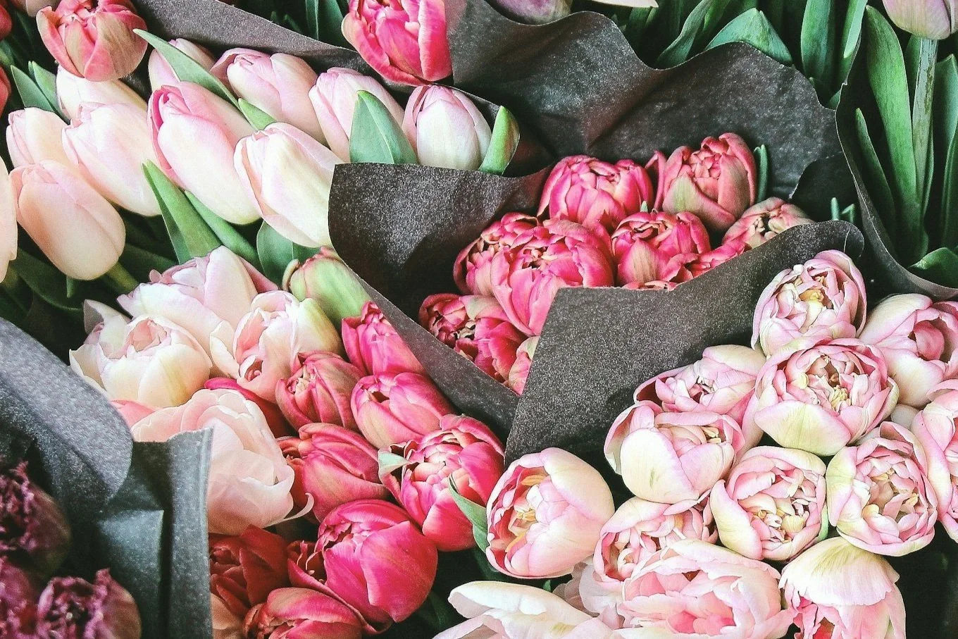
Inspired by the earthy color palette and botanicals, we aimed to create a brand identity that embodies a vibrant, romantic, and natural aesthetic. Our goal was to achieve a modern and sophisticated look that reflects the values of sustainability, quality, and affordability.
The Execution
During the design phase, the main objective was to create a logo that captured the brand's essence. This essence combined floral elements with an earthy and vibrant color scheme. The chosen color palette featured dusty rose reds, greens, and a hint of tans.
The marketing materials were designed to incorporate florals and handmade illustrations that echoed the brand's artisanal quality. The brand messaging focused on sustainability, affordability, and artisanal quality. The materials also maintained a vibrant, elegant, and timeless aesthetic.


